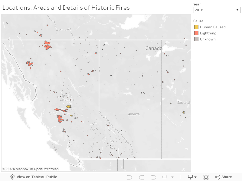

The map below plots the exact regions of wildfires for the years selected through the interactive dropdown list of years. The regions are color coded to reflect the cause of the wildfires.
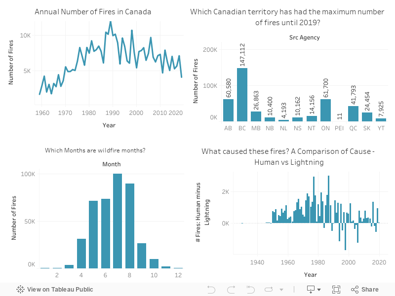
The dashboard provides a high-level overview of general trends related to wildfires prevalent in Canada. The top-left graph shows the annual number of fires. The number of fires shows an increasing trend up to the year 1989, after which we see a downward trend. Overall, the number of fires has a decreasing trend. The provincial distribution shown in the top right graph reflects that British Columbia has had the highest number of wildfires until the year 2019. The bottom-left graph identifies the fire season, with the core fire months being May-August, and the bottom-right graph suggests the humans are more often a cause for wildfires against natural causes like lightning.
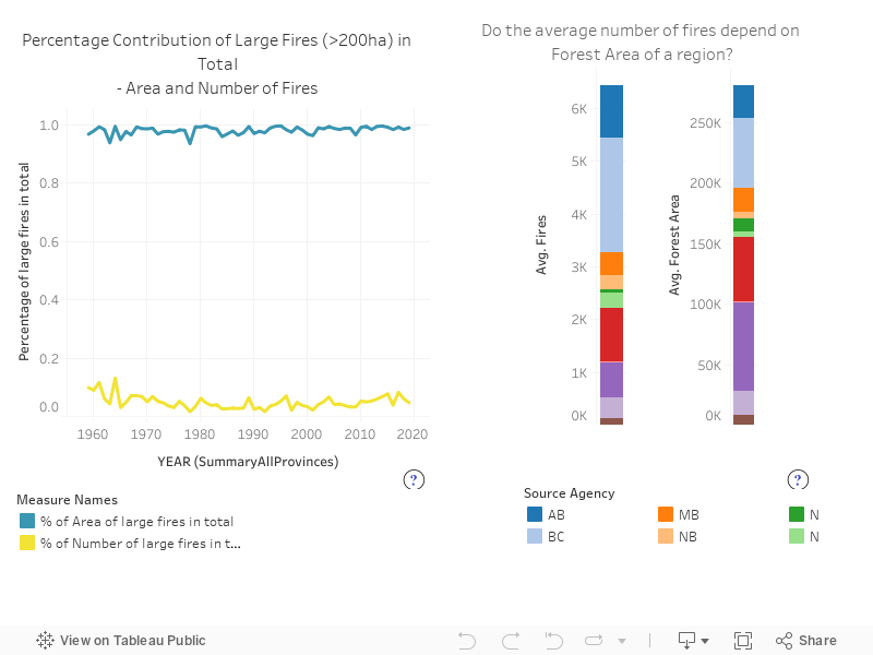
Factors related to the number of fires were analyzed. While the number of large fires (fires that cause a burned area of 200 ha or more) is small, the area burned by them makes up for a large proportion of the total area burned by all fires. Also, there is no direct relationship between the forest area of a province and the number of fires. Quebec has the largest forest area, but the number of fires is not the largest.
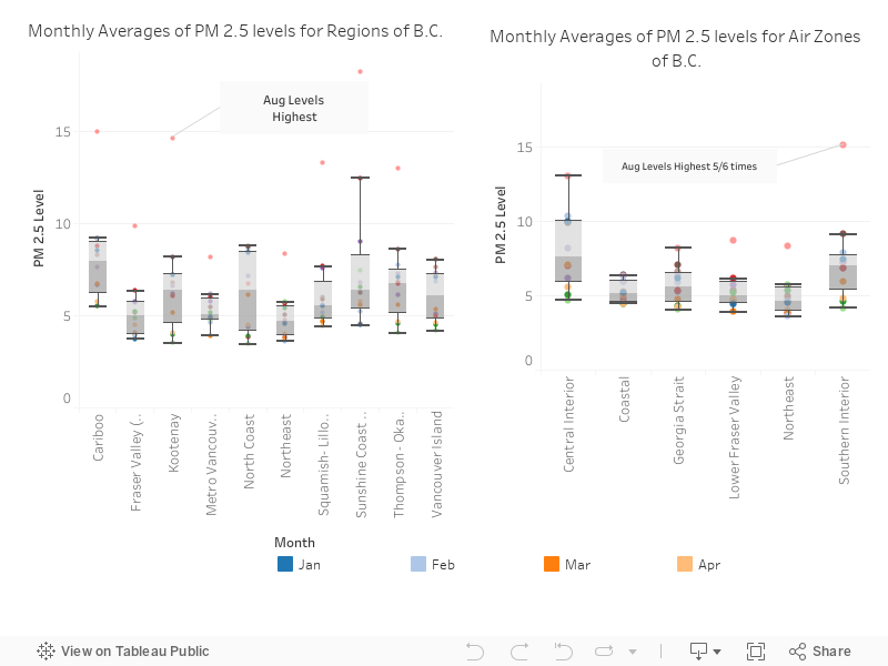
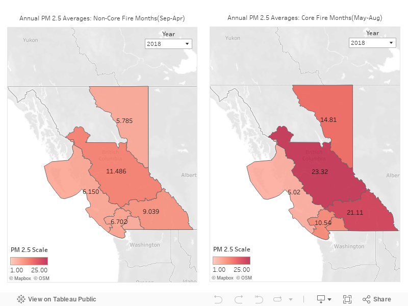
The aggregated levels of fine particulate pollutant PM 2.5 are plotted below for air zones of British Columbia. It can be seen that for the majority of areas, the PM 2.5 levels are at a high during August, a core wildfire month.
An interactive map showing average PM 2.5 levels is provided below. Selecting a year from the dropdown menu displays the values for each air zone of British Columbia. It is evident that the pollutant PM 2.5 has higher levels in the months of May-August as compared to other months. Please note that the values for PM 2.5 levels were extracted from stations where data was available. More details can be found onthe data page.
Climate and wildfires go hand-in-hand. The dashboard below presents an overview of how temperature, wind speeds* and precipitation have changed in each Canadian province over the years. The official weather monitoring stations used to capture these variables over the years are displayed on the map at the right of the dashboard. Notice that the Canadian Government adds and decommissions stations throughout the years, which can cause fluctuations in the overall climate trends.
*Wind speed data is only available up to 2014

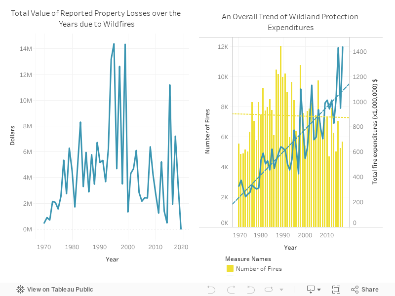
Reported property losses are plotted over the years in the graph on the left of the dashboard*. As wildfires started to occur more often in earlier years, government spending towards wildland protection efforts saw an increase. Even though we now have a decreasing number of fires over some recent years, government spending shows an increasing trend, as shown in the graph on the right. This correspondingly reflects that wildland protection methods are effective as we see a reducing number of fires in the overall trend.
*This data is not complete and has missing values, so only the reported values are plotted.
If you are not looking for something specific, here is a summarized story that shows the history of wildfires in Canada.