
So what am I looking at?
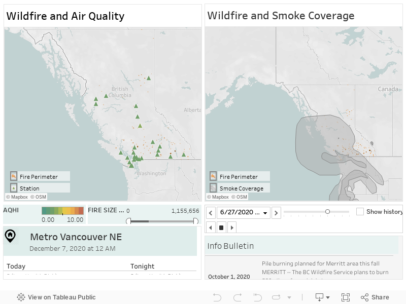
The visualizations here unveil the current state of wildfires in Canada*. The left map shows the perimeters of wildfires. Hovering over the highlighted area, you can learn about the size, status, and data source of a particular fire. The map also shows the air quality index measured at weather stations. Stations are marked as triangles, and their colors are mapped to the AQHI index. You can play with the fire size filter to know if there is a large fire in the region.
The right map shows the smoke coverage for a particular day along with the fire perimeter. You can use the interface controls to see an animation of how the smoke from a region is moving. That might help you to know whether on a particular day you will see an open, bright sky or a sad, dark sky filled with smog.
The bottom left window tells you the current air quality of your location, and the bottom right window makes you aware of any information bulletin related to wildfires in your region.
*The current visualization is limited to BC province; the data represented is a snapshot of a particular day. Ideally, it would be real-time, updating the information as it comes from the governmental data sources.